Have you ever considered how the visuals of a wine label influences the way in which you drink and enjoy the wine? I suppose I have, but only in the sense that I will often buy a wine based on whether or not I like the label. I’m no expert, but generally I know what I like, a malbec or a beaujolais, or a pinot gris. I know that I usually hate chardonnay with an almost religious fervour… but will still slug it down anyway if it’s the only thing on offer.
I also know that even though I love an old world wine, I will often buy a new world one, if only for the reason that I find the label ‘more fun’. They are generally less restricted by tradition and therefore more creative.

I can’t tell you if will like a single one of these wines that i’m showing you here. I’ve never tried them. But I do know that i’ll enjoy looking at it while I drink it. Whether or not I would perceive the taste of the wine to be different if the labels were different. I don’t know. Maybe it doesn’t matter. Then again, maybe it does.

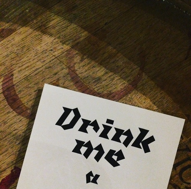
On Tuesday I went to a fantastic wine tasting at Laithwaites that explored just that. The relationship between graphics, font and design and taste, smell, experience. In the interest of no spoilers I can’t really talk about it, except to say it was jolly good fun!
Laithwaites paired up innovative graphic designer, type expert and founder of ‘Type Tasting’ Sara Hyndman to create a unique experience. Challenging and informative. Relaxed and highly enjoyable. I can’t recommend checking it out enough. You might be surprised by how your visual perceptions shape your reality.


Luckily for you, you can check it out! After two hugely successful sold out evenings, Laithwaites will again be holding this tasting on December 8th. You can find all the information and where to book on the website. Or just click here!
Just remember… no spoilers!
